
Pappas Hazy IPA – Can Design & Illustrated Crab Artwork
Designing the Pappas Hazy IPA can was one of those rare opportunities where a fun art project, local pride, and a personal bucket-list goal all lined up perfectly. Pappas is a Maryland institution, Monument City Brewing is a hometown favorite, and I’ve always wanted to design a beer can—so getting the chance to create something for both of them felt like winning a tiny creative lottery.
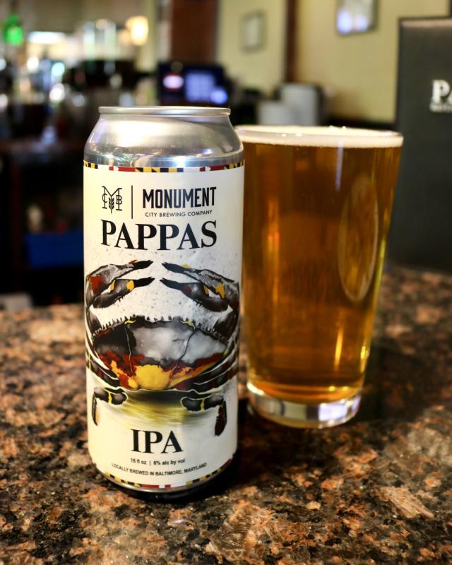
I kicked things off the same way I always do when I get to draw: with a stack of crab sketches. I filled pages with loose outlines, claw gestures, different poses—basically exploring every version of a crab that could reasonably show up on a can. Once I found the one that had the right energy, I moved into Photoshop and started digitally painting the final artwork.

That stage was where the illustration really came to life. I layered in color, texture, highlights, and splatter effects to create something bold and slightly gritty—something that felt rooted in Maryland without leaning too heavily into cliché. The final piece needed personality, motion, and a sense of being hand-crafted, and the digital painting approach let me push all of that.
With the artwork polished, I built out the full wraparound can design. This part was all about balancing the creative with the practical—making sure the crab took center stage while still fitting in the brewery branding, the Pappas story, and the overall vibe that ties the whole label together. It was a great blend of illustration, layout design, and storytelling.
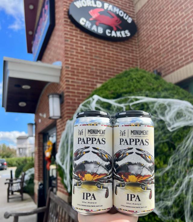
Seeing the finished cans behind the bar at Pappas—and watching people pick them up purely because the artwork caught their eye—was incredibly satisfying. Unlike a website, which lives on screens and servers, this was something physical, something you could literally hold. For me, it was a meaningful project that let me flex a different creative muscle and finally cross “design a beer can” off the list.
Related Projects